Own the Spectrum: A Real Person's Guide to Wearing Bold Color Without the Cringe
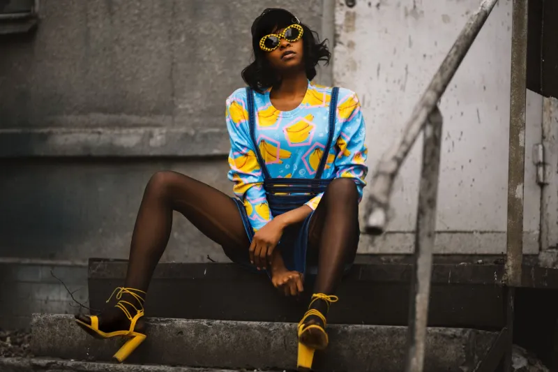
There's a version of wearing color that looks effortless — like the person just reached into their closet, pulled out a cobalt blue blazer, and walked out the door without a second thought. Then there's the other version, where it looks like someone got dressed on a dare. The difference isn't the color itself. It's the relationship the wearer has with it.
Most of us were never really taught how to use color. We were handed rules — wear neutrals for work, save brights for the weekend, black goes with everything — and then left to figure out the rest ourselves. No wonder so many people default to a wardrobe that's ninety percent gray and beige. It feels safe. But safe and boring tend to share a zip code.
This guide isn't about following trends or chasing whatever Pantone declared relevant this season. It's about building a real, personal relationship with color so that when you reach for something bold, it looks like you — not like you raided someone else's closet.
First, Figure Out What Your Skin Is Actually Doing
Before anything else, you need to know your undertone. This isn't about whether you're light, medium, or deep — it's about the underlying hue your skin leans toward. Warm undertones run gold, peachy, or yellow. Cool undertones go pink, red, or bluish. Neutral undertones are somewhere in the middle, which honestly means you have the most flexibility.
Here's a quick check: look at the veins on the inside of your wrist in natural light. If they read greenish, you're warm. If they look more blue or purple, you're cool. Both? Neutral.
Why does this matter for bold color? Because a warm-toned person who throws on a sharp, icy lavender can look washed out — not because lavender is bad, but because that specific lavender is fighting their natural warmth. Swap it for a dusty mauve or a golden amber and suddenly everything clicks. The goal is to find the version of a bold color that plays with your skin instead of against it.
Warm undertones tend to shine in earthy brights: terracotta, saffron, olive green, rust, warm coral. Cool undertones pop in jewel tones and clear brights: electric blue, emerald, fuchsia, true red, icy lilac. Neutrals? You can usually pull from both columns, which is a genuinely good problem to have.
The Grounding Principle: Let One Thing Be Loud
One of the biggest mistakes people make when experimenting with color is going all-in at once. Head-to-toe saturated color is a skill — it works, but it requires confidence and precision that most people haven't built yet. The easier, more wearable approach is the grounding principle: let one element be the color story, and let everything else support it.
Say you want to wear a deep, saturated teal. Great choice. Now pair it with camel trousers and white sneakers. The teal does all the talking. The rest of the outfit creates a frame that makes the color land harder, not softer. This isn't about playing it safe — it's about giving the color room to breathe.
Neutrals that work especially well as supporting players: warm off-white, camel, sand, stone gray, navy (which is technically a neutral in practice), and chocolate brown. These shades don't compete — they amplify.
Once you get comfortable with one bold piece, you can start experimenting with two. But even then, the most effective combinations usually involve one dominant color and one that echoes or contrasts it at a lower saturation. Think: bright mustard top with dusty rose trousers. Or a vivid green jacket over a soft sage tee. The palette feels intentional because one color is clearly in charge.
Color as Signature, Not Statement
Here's where the psychology gets interesting. The people who wear color best aren't necessarily making a statement — they're just expressing a preference they've had for a long time. Think of someone you know who always wears a specific color. It doesn't feel like they're trying. It feels like them.
That's the difference between color as costume and color as signature. A signature develops over time. You start noticing that you keep gravitating toward warm reds, or that every time you wear cobalt something good happens, or that olive green is the only color that makes you feel like yourself in a room full of strangers. You lean into it. You build around it.
Choosing a signature color — or a small family of two or three — also makes getting dressed dramatically easier. Instead of starting from scratch every morning, you have a through-line. Your wardrobe starts to feel cohesive even if the individual pieces are wildly different in style.
To find yours, go through what you already own and pull out anything with color. Which pieces do you reach for most? Which ones make you feel good when you catch your reflection? That's data. Trust it more than any trend report.
Breaking the Rules (The Right Way)
Once you've got a handle on your undertone and your go-to palette, you can start playing with contrast and unexpected combinations. Color theory gives us a few reliable frameworks: complementary colors (opposites on the color wheel, like orange and blue) create high-energy contrast. Analogous colors (neighbors on the wheel, like green and teal) feel harmonious and a little more relaxed.
But honestly, some of the best color pairings break both of those rules entirely. Red and pink used to be considered a clash — now it's one of the most intentional combinations you can wear. Same with brown and black, or yellow and gray. What makes these work isn't the theory — it's confidence and proportion.
If you want to experiment with unexpected pairings, start with accessories. A bold-colored bag or pair of shoes is a low-stakes way to test a color combination before you commit to a full outfit. If the cobalt loafers work with your olive green pants, you've learned something. If they don't, you've only lost five minutes.
The Actual Secret
Wearing bold color without looking like you're trying too hard comes down to one thing: repetition. The more often you wear a color, the more natural it looks on you — to you and to everyone else. The first time you wear a bright orange linen shirt might feel like a lot. The fifth time, it's just your shirt.
Color confidence isn't something you're born with. It's something you build by showing up, wearing the thing, and not making a big deal out of it. That's the whole code.